Scroll Down
Scroll Down
Scroll Down
CLIENT — OOLA
PROJECT — Visual Identity Design
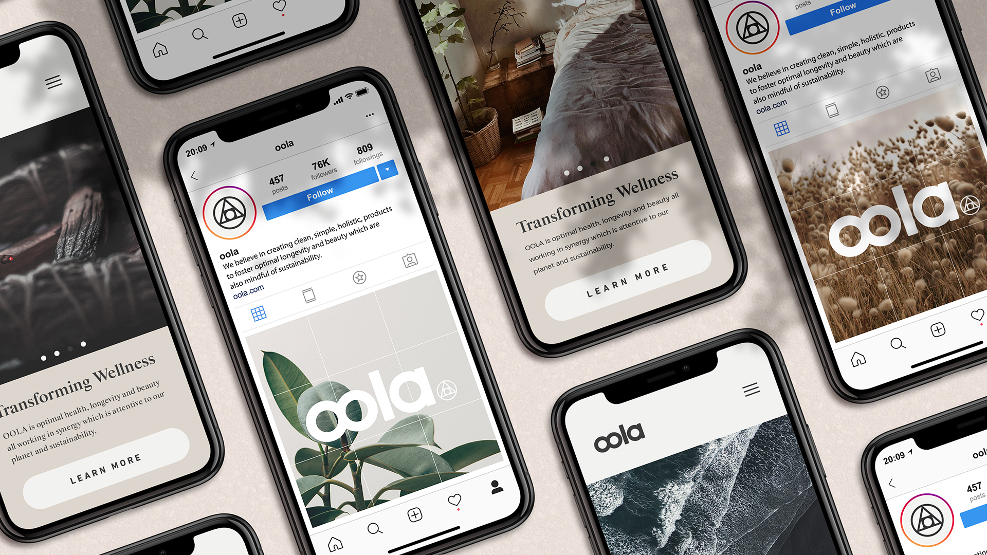
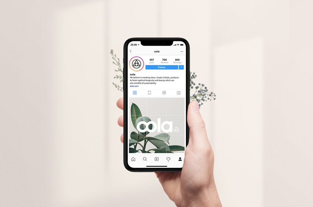
DELIVERABLES — Branding, Web Design, Social
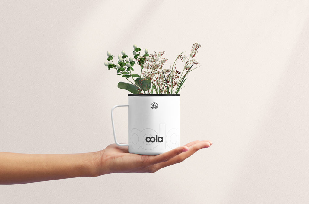
OOLA is more than just health & wellness, it’s the embodiment of the innate human ability to transform and transcend. OOLA empowers the lives of individuals and families, to help heal communities through the use of a holistic and ethical product line.
The Project
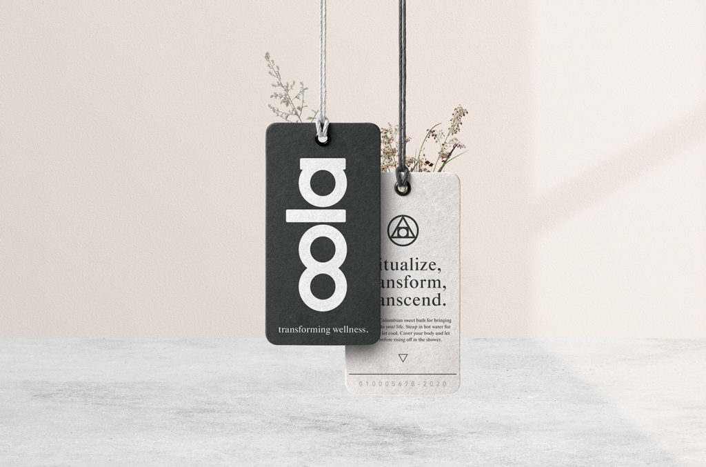
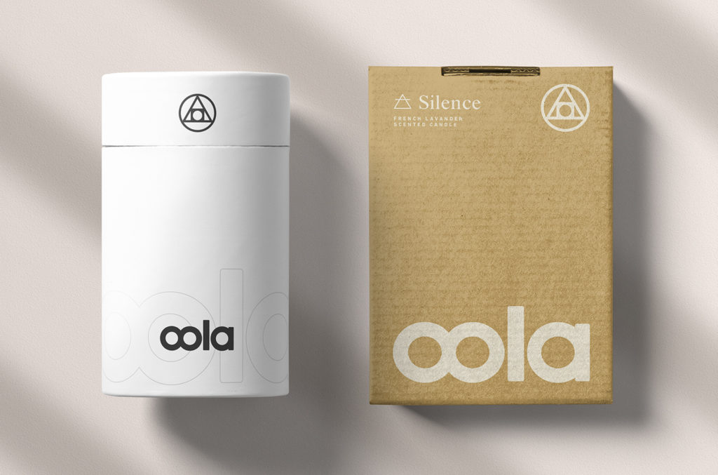
The brand identity includes the mark of the philosopher’s stone, as seen with the overlapping geometric symbols of circle, triangle, and square. The philosopher’s stone is highly regarded in the ancient art of alchemy and it symbolizes the ability to take a base material and through a process of transmutation change into gold.
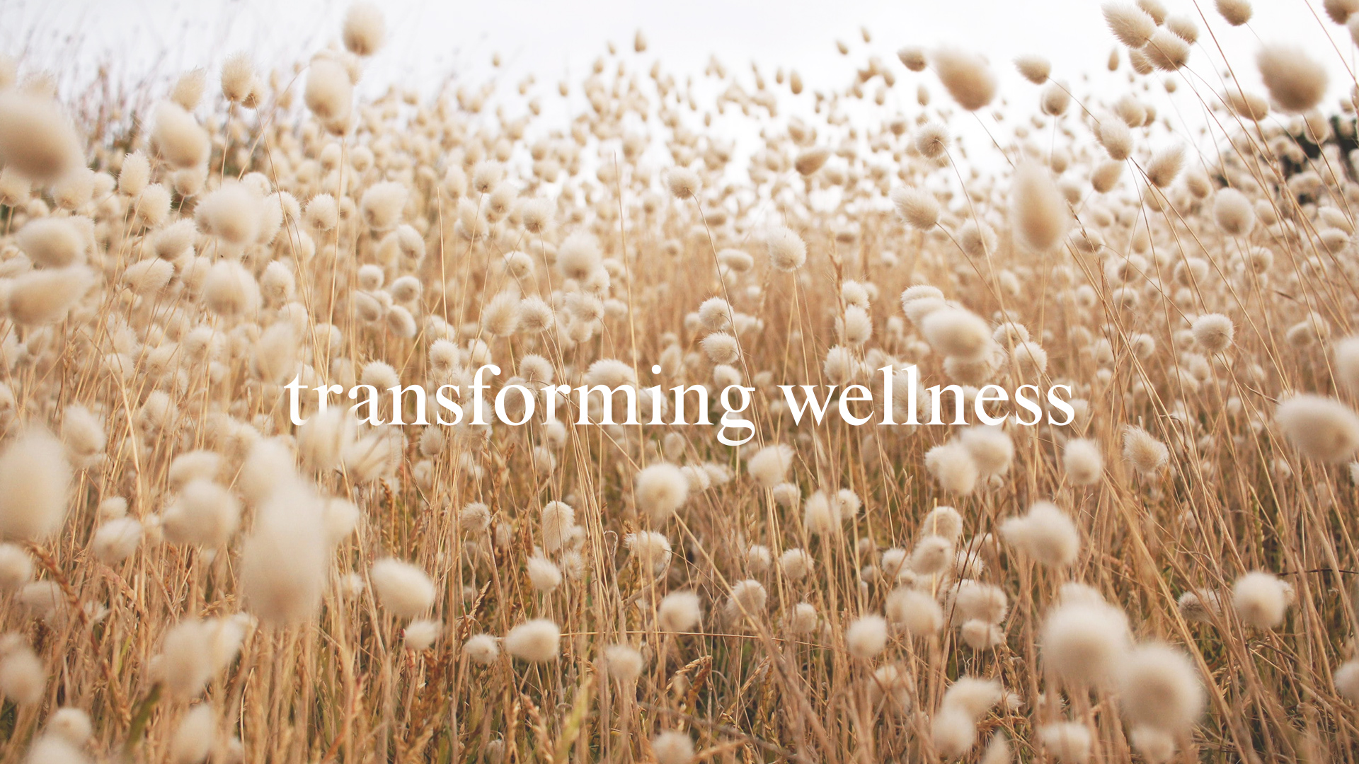
This ability to transform, change, and transcend is at the heart of what OOLA aims to achieve through the use of its products. The process of change in the direction of health is where the brand’s tagline was created, Transforming Wellness.
Ritualize, Transform, Transcend.

Design Concept
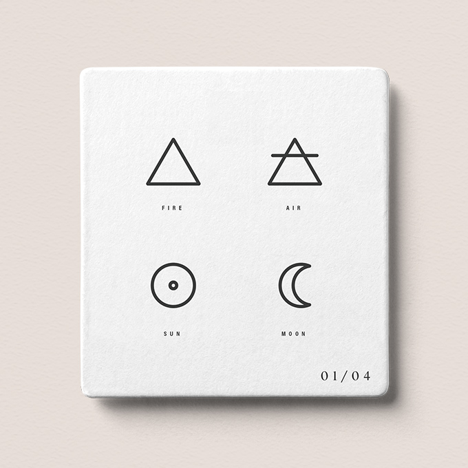
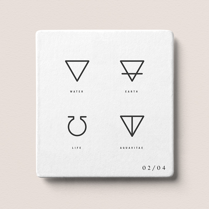
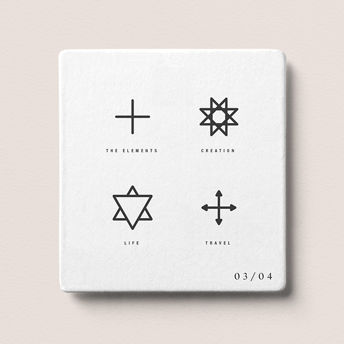
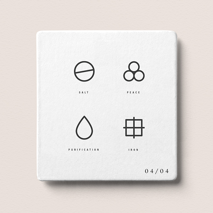
To complement this primary logo, a series of symbols are used to depict certain aspects of the OOLA product line. These symbols become a visual language that also ties back to the sacred knowledge found in alchemy in regards to certain materials and elements such as earth, fire, air, and water.
The Results
The brand resonates with the vibrations of both simplicity and natural balance to create change. The thoughtful use of imagery and purposeful messaging creates intent and meaning to allow the fundamental aspects of transformation and wellness to take center stage.