Scroll Down
Scroll Down
Scroll Down
CLIENT — SMITH
PROJECT — Visual Identity Design
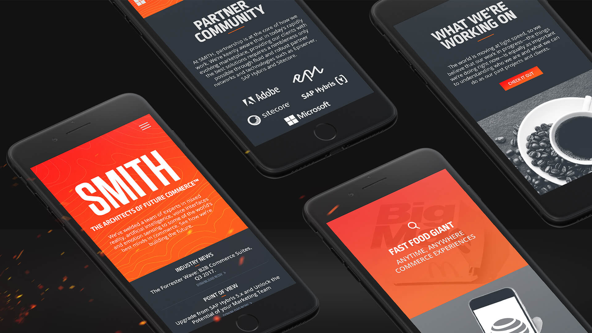
DELIVERABLES — Branding, Web Design
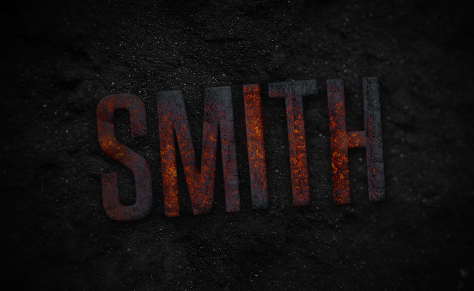
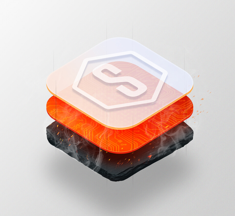
SMITH’s rebrand takes inspiration from the colours produced as metal is heated and cooled through the process of black body radiation. As dark cool metal is heated, it is transformed into hotter more malleable orange and red hues. The use of more vibrant and energetic colours helps elevate the SMITH brand into a more modern space and creates a lasting and memorable impression.
The Project
The process of forging and folding iron, steel, and charcoal creates a metal alloy that is both stronger and more beautiful than its individual raw components. Through metallurgy and chemistry the composite is left with striations as the metal is cooled and polished that are complex and intricate. By simplifying the Damascus pattern and using it in subtle ways to compliment the colour palette, the concept of SMITH becomes less literal and more metaphorical in its visual representation.
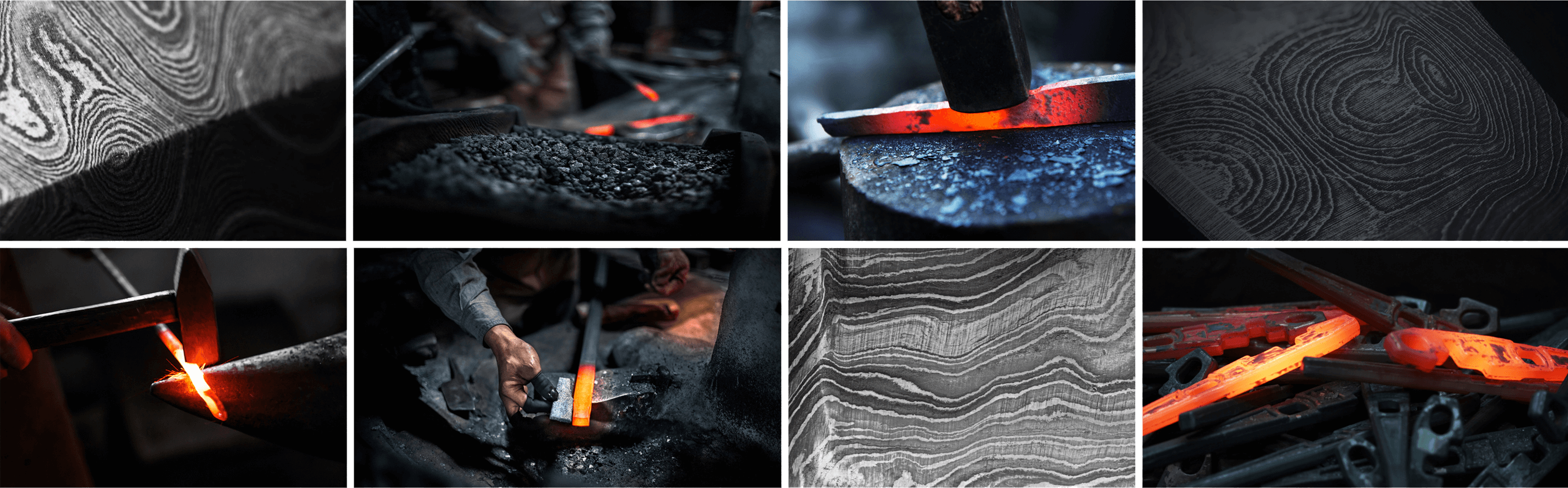
Texture | Photo Inspiration

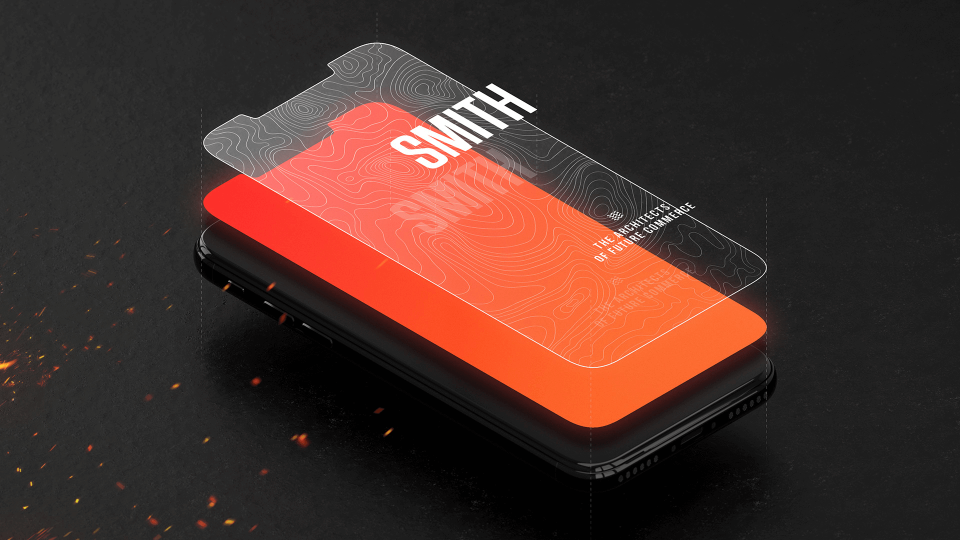
The Architects of Future Commerce
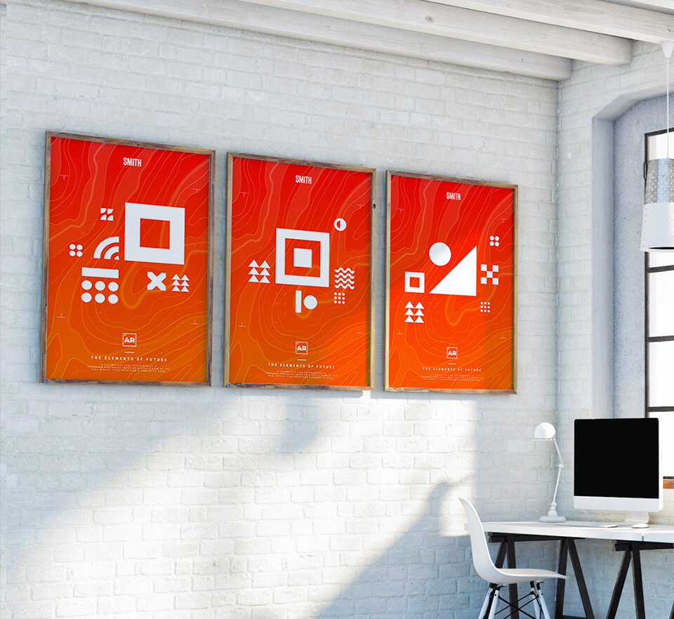
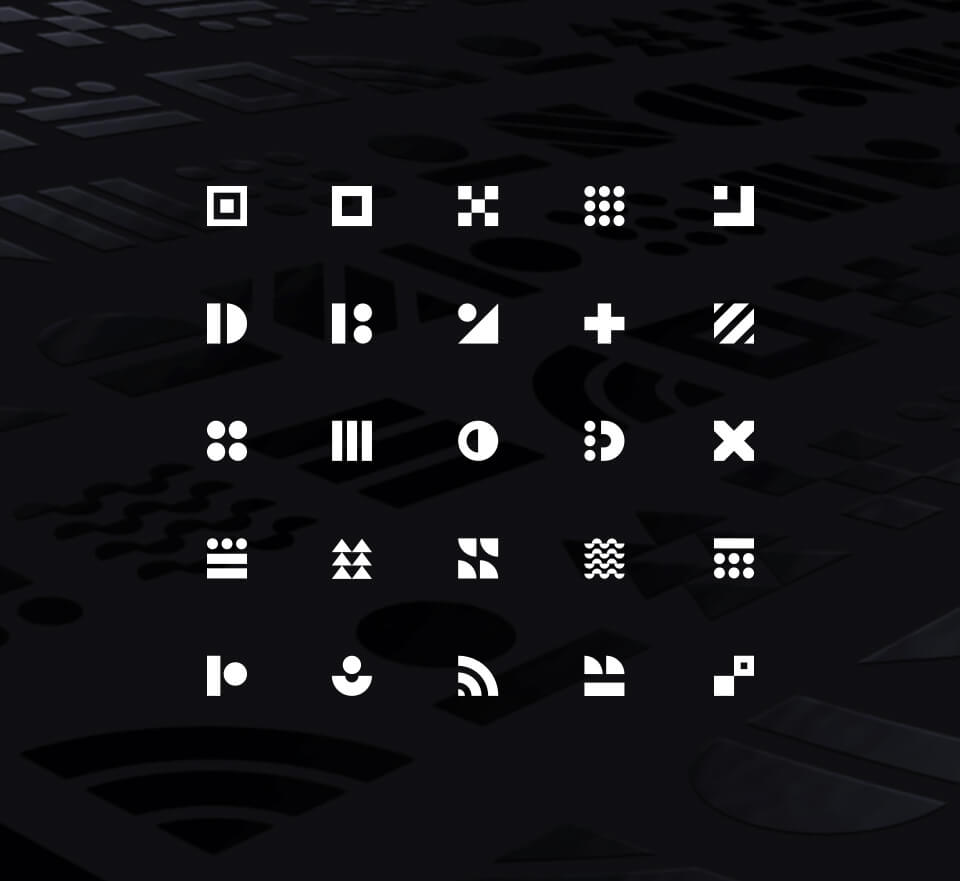
Glyphs
By introducing a set of symbols within the SMITH brand helped create a visual language that is both engaging and purposeful. The glyphs are used in combination with words and images to help convey SMITH messaging. They also serve as a way to spawn mixed reality experiences by using them as fiducial markers. The glyphs were used at the SMITH open house and launched tailored AR experiences in the main lobby of SMITHS newly renovated office.
The Results
SMITH’s rebranding was so well received that it was adapted into a full office renovation where we were able to overhaul the entire office space in multiple locations. The brand was also featured at the annual awards ceremonies where the brand was revealed for the first time to all SMITH employees from around the world.